
🎨 Color Palette & Mood in Games
TL;DR: Color Palette is a carefully selected and tightly controlled set of colors to establish the dominant emotion (mood) of a game. This is the practical application of Color Science — turning color theory into an emotional language that players sense without consciously realizing.
If Color Science is the science of how the human eye perceives light, then Color Palette is the art of using that knowledge to tell stories. A gloomy dungeon game doesn’t need to say “This place is dangerous” — the cold blue-grey palette with blood-red spots communicates that before the player notices any enemy.
Core Concepts
A Color Palette for a game is typically built according to the 60-30-10 principle [S1]:
| Component | Ratio | Role |
|---|---|---|
| Dominant Color | 60% | Main background color, establishing overall world mood |
| Secondary Color | 30% | Supporting color for architecture, NPCs, secondary environment |
| Accent Color | 10% | Highlight color for interaction points, dangerous enemies, important items |
Color Temperature and Emotion
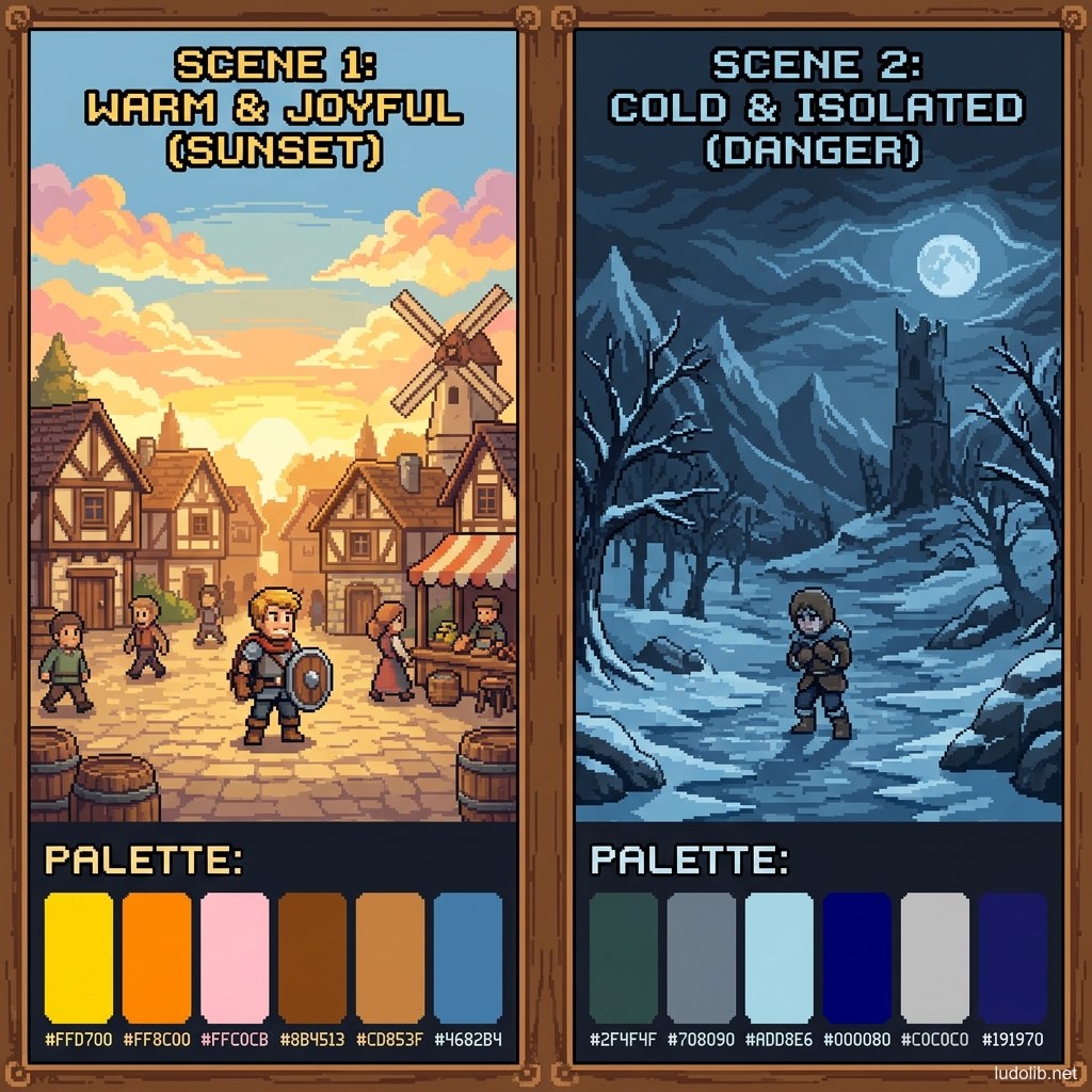
- Warm colors (Red, Orange, Yellow): Energy, danger, passion, warmth. Often used for boss rooms, combat scenes, volcanic areas.
- Cool colors (Blue, Purple, White): Peace, mystery, loneliness, coldness. Often used for ice regions, peaceful scenes, defensive magic areas.
- Neutral colors (Brown, Grey, Beige): Realism, weariness, neutrality. Often used for ordinary cities, early game areas without specific coloring [S2].
Operating Principles
Colour Grading (Global Color Correction)
Like cinema, many modern games apply post-processing colour grading — a color filter layer applied to the entire screen after rendering. This technique allows changing the mood of the same scene just by swapping the LUT (Look-Up Table) without redrawing any texture [S2].
Practical example: when a character is poisoned, the game can shift the entire palette toward green + desaturate so players feel the critical state through color before even noticing the HP meter.
Atmospheric Perspective
A technique borrowed from traditional painting: distant objects appear more faded, gradually shifting toward blue. In Open World games or platformers, this technique creates a sense of spatial depth and distance without high 3D rendering costs [S1].
Colour-Coded Communication
Color is the fastest language in games. Some conventions have become silent industry standards [S3]:
- 🔴 Red = damage, danger, enemy
- 🟢 Green = health recovery, safe, ally
- 🟡 Yellow = rare items, experience points, warning
- 🔵 Blue = mana/magic energy, information
Game Examples
- Celeste (Maddy Thorson, 2018) — Each chapter has a distinct palette reflecting the protagonist’s psychological state: Chapter 2 (mysterious purple temple) represents blurred reality-dream ambiguity; Chapter 6 (cold white snowy peak) represents emptiness and exhaustion [S3].
- Journey (thatgamecompany, 2012) — Game uses warm golden sand palette to create a feeling of loneliness but wonder. When the game shifts to the final ice section, the palette shift to cold blue-white creates a clear feeling of exhaustion without a single line of text.
- Hades (Supergiant Games) — The Underworld palette leans warm red-purple-gold, but each area has its own accent color (Asphodel = fire orange, Elysium = golden glory) — helping players spatially and psychologically orient when playing roguelite.
Trade-offs
| Aspect | Content |
|---|---|
| ✅ Advantages | Consistent palette creates strong brand identity and helps players process visual information faster. |
| ❌ Disadvantages | Overly strict palette can make different areas of the game look similar, reducing the sense of exploration. |
| ⚠️ Common Pitfall | ”Palette overload” in RPG games — too many item types, quests, factions all using distinct colors makes players unable to decode the color system. |