
🦸 Character Design in Games
TL;DR: Character Design is the process of creating the shape, visual personality, and image identity for game characters — transforming an abstract concept into a soulful entity that players can recognize instantly. A successful character design must both tell a story through form and function efficiently within the game’s technical environment.
When players see Mega Man with his blue armor and left-hand cannon for the first time, they immediately understand: this is a robot hero, this is a weapon, this is an action character. No explanation needed. That’s the success of good Character Design — communicating identity, function, and emotion through form and color alone.
Core Concepts
Character Design in games differs from Character Design in animated films at one important point: game characters must function as a system. Design must account for polygon limits, animation needs (where bones need to be inserted), and the ability to clearly distinguish in battles with many simultaneous on-screen characters [S1].
| Element | Question to answer when designing |
|---|---|
| Silhouette | Can the character be recognized from just a black shadow (no color, no detail)? |
| Color Palette | What do the 3 dominant colors say about personality? (Red = danger/passion, Blue = calm/magic) |
| Shape Language | Round = friendly, triangle = dangerous, square = solid |
| Readable at Scale | Can the character be read when scaled down to a 32x32 pixel icon? |
| Faction/Class Legibility | Can players distinguish which faction the character belongs to within 1 second? |
Operating Principles
Standard Character Design Process
Starting from the Game Designer and Art Director brief, the Character Artist goes through this loop [S2]:
- Silhouette Thumbnails — Draw 10-20 different black shadows, no details, only testing overall form.
- Rough Concepts — Develop the 3-5 best directions from thumbnails, adding basic colors and large details.
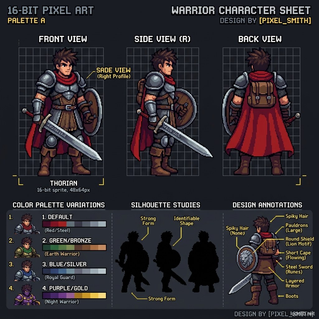
- Turnaround Sheet — Character drawings from 4 viewpoints (Front, Side, Back, ¾) as documentation for the 3D team.
- Expression Sheet — Main facial expressions to guide animators.
- Colour Variants — Color variations for different versions (skins, enemy factions, DLC).
Readable Silhouette — The Golden Rule
Silhouette is the most important test [S1]. In multiplayer or crowd games, players must identify opponents in an instant. If two different character classes have similar-looking silhouettes → design fails. Valve even published a public document about this rule when designing classes in Team Fortress 2 [S3].
Game Examples
- Team Fortress 2 (Valve, 2007) — 9 character classes designed with completely distinct silhouettes (Scout: slim and tall, Heavy: big and broad, Spy: slender in a vest). Each class reads immediately from shadow in any lighting condition [S3].
- League of Legends (Riot Games) — With hundreds of champions, Riot has a strict design criteria system: each champion must convey Role (Tank/Mage/ADC) and Fantasy (aesthetic story) through the default skin alone.
- Cuphead (Studio MDHR) — Characters designed to the Fleischer animation standard of the 1930s: exaggerated body proportions (rubber hose style), no sharp edges to match the game’s Hand-drawn 2D aesthetic.
Trade-offs
| Aspect | Content |
|---|---|
| ✅ Advantages | Well-designed characters become independent brand assets (Mario, Sonic, Master Chief) — marketing value far exceeding the game itself. |
| ❌ Disadvantages | Overly complex design (many details, high textures) significantly increases animation and 3D modeling costs. |
| ⚠️ Common Pitfall | ”Isolated design” — Character Artist designs beautifully but doesn’t match the game’s overall graphic style, creating visual dissonance. Must continuously reference Concept Art and mood boards. |