
🔤 Typography in Games
TL;DR: Typography in games is the art of selecting and using typefaces to convey information and emotion without hindering gameplay. A wrong font doesn’t just make the interface look bad — it breaks visual consistency and reduces readability in high-speed situations.
Written text in games has a dual mission: both as a practical information delivery tool (how much health remains, what the quest is) and as an aesthetic element that shapes the personality of the entire game world. From 8-bit pixel fonts to complex Gothic calligraphy, every typeface choice is a design statement.
Core Concepts
| Font Type | Characteristics | Commonly Used For |
|---|---|---|
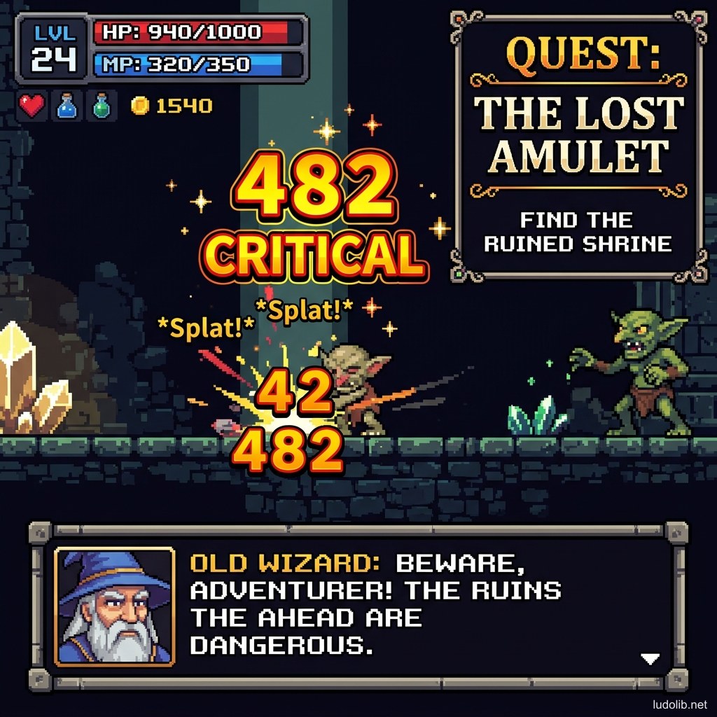
| Pixel Font | Each character built from square pixels, reads well at small sizes | HUD, health bars, statistics |
| Serif | Has serifs (feet) at stroke ends, classic formal feel | Fantasy game titles, main menu |
| Sans-Serif | No serifs, clean and modern | Modern UI, mobile games, sci-fi |
| Handwritten / Script | Simulates handwriting, warm or mysterious feel | Character journals, in-world notes |
| Display / Decorative | Strong artistic font, unreadable at small sizes | Game logo, loading screen title |
Operating Principles
Readability vs. Legibility
Two concepts often confused [S1]:
- Legibility (Character recognition ability): Is each letter clear enough to distinguish? Do “l”, “I”, “1” look different?
- Readability (Continuous reading ability): Is an entire paragraph easy to read left to right? Is line spacing (leading) and character spacing (kerning) reasonable?
In game environments, players typically read in poor conditions: screen 3m away (TV), dim room lighting, or distracted by surrounding action. Good readability is priority #1.
Type Hierarchy
Not all text in a game is equally important. Designers create hierarchies through size, weight, and color:
- H1 — Screen title (largest, usually display font)
- H2 — Quest name / Area name (medium, semi-bold)
- Body — Item descriptions, lore text (small, regular weight, airy line-height)
- Label — HUD statistics (pixel font or monospace for alignment)
Localisation and Typography
English fonts often don’t support special characters for Vietnamese, Japanese, Chinese, Korean [S2]. This is a major challenge when localizing games — studios must prepare separate fonts for each language or use heavier multi-language fonts that consume more VRAM.
Game Examples
- Disco Elysium (ZA/UM) — Uses classic serif font for lore text combined with novel-book layout, emphasizing the game’s narrative character. The font choice deliberately evokes the feeling of reading a dark 20th-century novel.
- Hollow Knight (Team Cherry) — Uses a custom alphabet for the “Bug” language (Old Nail), forcing players to decode it themselves to discover hidden lore — typography becomes a gameplay mechanic.
- Among Us (Innersloth) — Simple pixel font works perfectly with the Casual minimalist aesthetic, ensuring readability on all mobile screen sizes [S3].
Trade-offs
| Aspect | Content |
|---|---|
| ✅ Advantages | The right font reinforces game world personality without adding any graphics. This is a low-cost, high-impact element. |
| ❌ Disadvantages | Licensed fonts can cost significant fees for commercial projects. High-quality free fonts (Google Fonts) usually lack pixel-ready variants. |
| ⚠️ Common Pitfall | Using too many different fonts in the same game (> 3 fonts) creates clutter. General rule: one Display font, one UI font, maximum one special font. |