
🧩 Material Design in Mobile Games
TL;DR: Material Design is a design language developed by Google that applies physical principles like light and shadow to create clearly hierarchical interfaces on 2D surfaces. In Mobile Game interface design, it helps reduce cognitive load for players in secondary screens (meta-game) like menus, inventory, or leaderboards.
Material Design is not exclusive to ordinary mobile apps — it has become an important foundation in UI UX Design for many games, especially Casual games and light puzzle games. Rather than using overly cumbersome real-material simulation interface (Skeuomorphism), this style delivers cleanliness, spatial logic, and optimized operation speed for small touch screens.
Core Concepts
Introduced in 2014 by Google [S1], Material Design draws inspiration from paper and ink in the real world — but upgraded with digital technology power.
| Principle | Brief Description | Application in Games |
|---|---|---|
| Material is the metaphor | Interface simulates real materials (paper) with thickness and physical interaction. | Character or item cards with drop shadows to emphasize rarity. |
| Bold, graphic, intentional | Using strong colors, large typography, and clear whitespace. | Highlighting the “Play” or “Purchase” button with high-contrast color schemes. |
| Motion provides meaning | Motion helps direct attention and provides interaction feedback. | Ripple effect when pressing skill button, creating instant response feel. |
Operating Principles
In the game space, Material Design establishes an extremely clear visual hierarchy (Visual Hierarchy) through the Z axis (depth). Rather than completely flat graphic layers, an important button (Floating Action Button - FAB) will have a larger shadow index — signaling to players that this element is “closest” to them and immediately interactable.
Additionally, the grid system and standard 8dp (Density-independent pixel) spacing help all UI components on different phone screen resolutions maintain consistency — ensuring seamless experience and optimal performance for the HUD system and navigation menus.
UI Components Adapted for Games
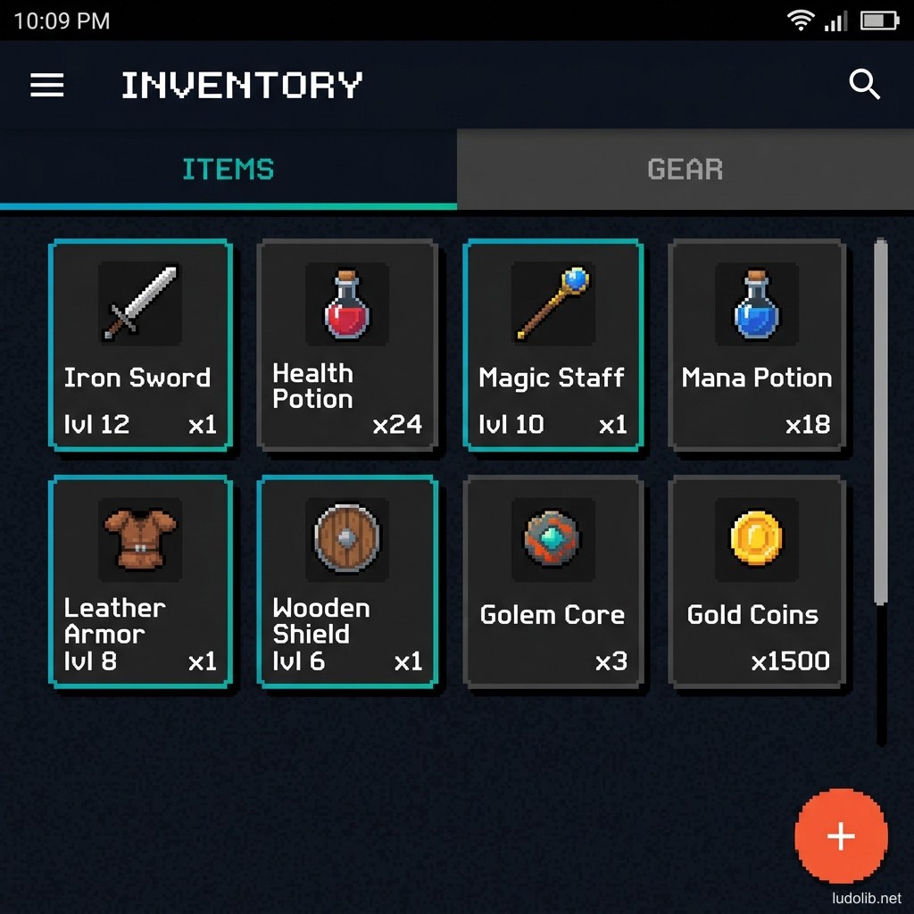
- Cards: Powerfully applied in Gacha or card strategy games. Each card functions as a separate surface entity fully displaying character visuals and skill stats.
- Bottom Navigation: Navigation bar at the bottom of screen extremely common in modern mobile games. Allows players to easily use a single thumb to switch between Home, Shop, Inventory, and Guild.
Game Examples
- Pokemon GO — Pokedex menu interface and account settings system use flat colored card structure with light shadows and characteristic Google ripple touch feedback.
- 2048 — Puzzle game genre using flat design with clearly hierarchical vivid colors based on the numbers — following Material minimalism principles.
- Monument Valley — Though the game itself is a 3D isometric graphics environment, the entire navigation menu and external UI apply clear hierarchy philosophy with large whitespace — extremely user-friendly.
Trade-offs
| Aspect | Content |
|---|---|
| ✅ Advantages | Prevents small phone screens from becoming cluttered. Extremely suitable for meta-game streams (upgrade systems, shopping) that need to convey large amounts of information as lists. |
| ❌ Disadvantages | Can lose immersion if overused in story-heavy games (like Horror or JRPG) — the game interface ends up looking like a regular utility app. |
| ⚠️ Common Pitfall | Trying to layer too many overlapping shadows makes the UI cluttered — goes against the original space-cleaning philosophy. |