
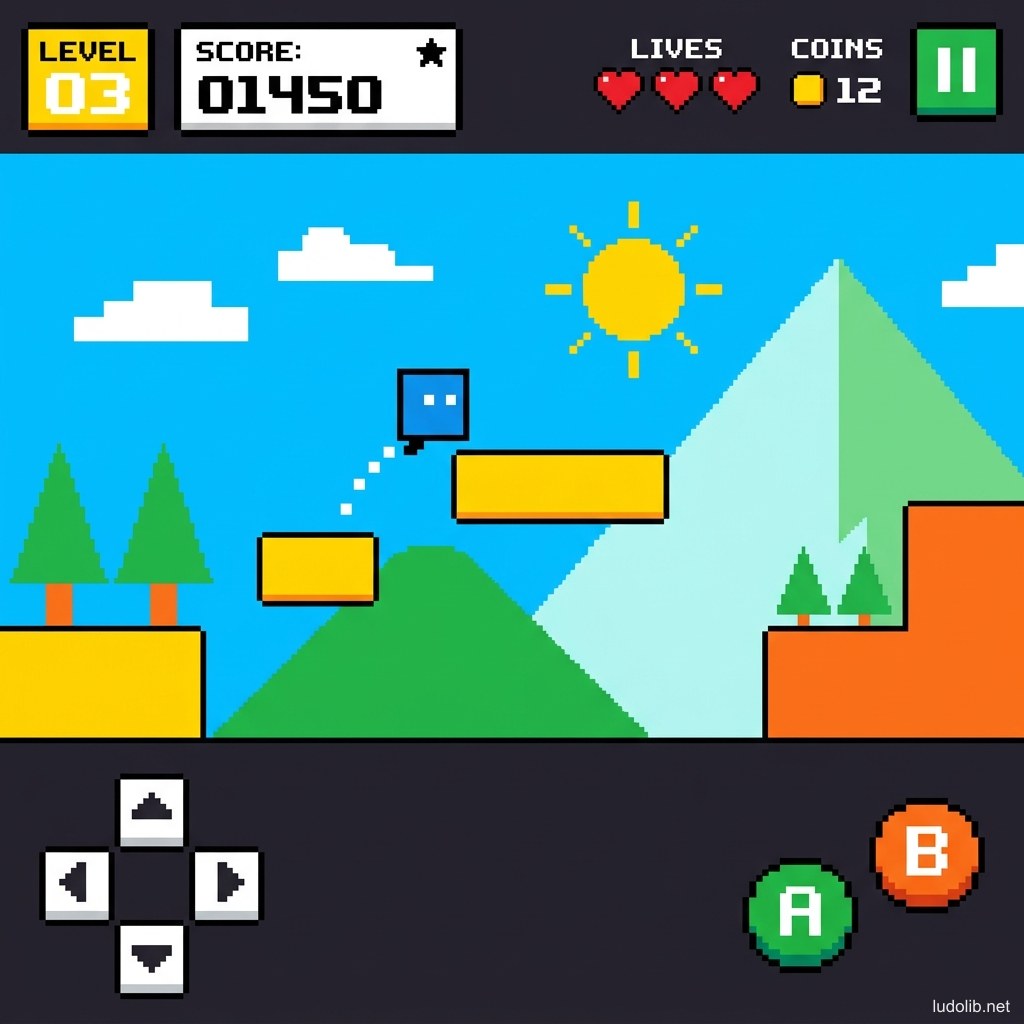
⬜ Flat Design in Games
TL;DR: Flat Design is a graphics style that completely eliminates depth-suggesting elements — no real drop shadows, no gradients, no textures — using only uniform flat colors, simple geometry, and clear typography. The style originated from digital UI design but has expanded to the visual style of many casual and mobile games.
Flat Design emerged strongly when Google launched Material Design (2014) and Apple switched to iOS 7 Flat UI (2013) — both reacting against the previous “skeuomorphism” (excessive real-material simulation) trend. In games, Flat Design most frequently appears in mobile casual, puzzle, and hyper-casual — where quick comprehension and low visual energy load matter more than aesthetic impression.
Core Concepts
| Rule | Description | In contrast to |
|---|---|---|
| No Drop Shadow | No real drop shadows (only very light, flat shadows possible) | Skeuomorphism with detailed 3D shadows |
| No Gradient | Uniform flat color, no gradual color transitions | Synthwave’s neon gradients |
| No Texture | Completely smooth surface, no texture | Watercolor, Claymation |
| Bold Color | Strong, highly saturated, clear colors | Painterly’s muted palette |
| Simple Geometry | Basic shapes: circles, squares, triangles, quadrilaterals | Organic forms of Hand-drawn |
| Clear Hierarchy | Size and color clearly hierarchize information | Comic style’s decorative visual |
Operating Principles
Why Flat Design Works Well for Mobile?
Mobile games have many constraints making Flat Design a pragmatic choice [S1]:
- Small screens: Simple forms read better at all sizes
- Short sessions: Players need to understand the interface immediately, no time to “read” the visual
- Performance: Flat assets are lighter, no complex shaders needed
- Touch input: Buttons and hitboxes need to be clear — flat shapes make hitboxes precisely match visuals
Flat Design vs. Minimalist
| Criteria | Flat Design | Minimalist |
|---|---|---|
| Colors | Bold, bright, saturated | Often muted, monochrome, or more limited |
| Shapes | Clear geometric | Can be very abstract |
| Content | Functional — serves UI/UX | Artistic — serves experience |
| Application | Casual, mobile, puzzle games | Art games, experience games |
Flat 2.5D — Popular Variant
Semi-flat or Flat 2.5D adds a very light drop shadow layer (flat shadow, no gradient) to create slight depth without breaking flat principles. This is the most common style in modern mobile games — flat but not completely depthless [S1].
Game Examples
- Monument Valley (ustwo games, 2014) — Combines Flat Design with Escher-style impossible geometry. Vivid solid colors, no texture — elegant visual language instantly recognizable.
- Threes! (Sirvo LLC, 2014) — Puzzle game entirely consisting of flat colored tiles with clear typography — Flat Design for gameplay.
- Alto’s Adventure (Snowman, 2015) — Flat silhouette on flat gradient background. Creates a minimal aesthetic that’s still beautiful and emotional.
- Reigns (Devolver Digital, 2016) — Minimal UI with flat design cards, no complex background art — proving Flat Design can be beautiful in narrative games.
Trade-offs
| Aspect | Content |
|---|---|
| ✅ Advantages | Scalable on all screens without quality loss. Extremely fast to produce — no complex textures or lighting setup needed. Most accessible to the widest mainstream audience. |
| ❌ Disadvantages | Hard to create high depth and immersion feeling. Very easy to look generic if palette is not carefully curated. Not suitable for narrative-heavy games needing atmosphere. |
| ⚠️ Common Pitfall | ”Boring flat” — using default colors (primary red, blue, green) instead of a carefully designed palette. Flat Design still needs strong color theory and composition to avoid becoming placeholder art. |