
📄 Paper Cutout Style
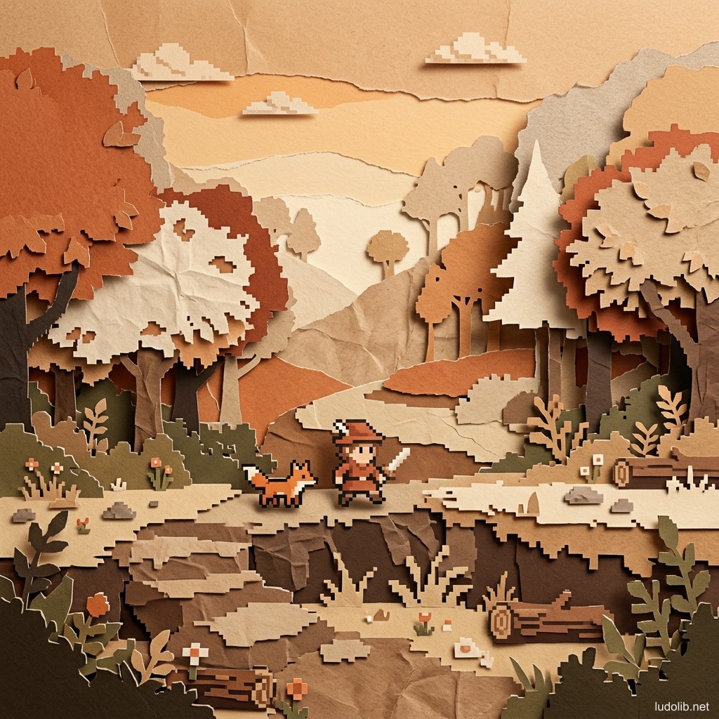
TL;DR: Paper Cutout Style is a graphics style simulating a world created from layers of cut and stacked paper — creating depth through light drop shadows between layers, rough paper texture, and organic torn edges. This is the style with the most clearly handcraft feeling in the game industry — evoking warmth and folk artistic sensibility.
The origins of paper cutting art (paper cutting, kirigami) appear in many cultures — Japan (kiri-e), China (jiǎnzhǐ), Mexico (papel picado), Poland (wycinanki). When brought into games, this style creates the feeling of looking into a handmade diorama box — where each character and tree is a carefully cut piece of paper pinned to a background.
Core Concepts
| Element | Characteristic | How to Create |
|---|---|---|
| Layered Depth | Multiple flat paper layers stacked, creating depth through distance | Parallax scrolling + layer shadow |
| Drop Shadow | Light shadow from each paper layer onto the layer behind | Soft shadow with small offset |
| Paper Texture | Rough paper grain appearing lightly on surfaces | Texture overlay, grain filter |
| Torn/Cut Edges | Object edges not perfectly flat — suggesting torn or handcut paper | Irregular edge brush, noise displacement |
| Limited Color | Palette often warm, earthy, limited color count | Beige, earth brown, faded blue, brick red |
| Silhouette Character | Characters often pure black silhouettes or single-color | Flat color with no internal detail |
Operating Principles
Parallax Layering — The Depth Creation Secret
Though all elements are flat, Paper Cutout creates very convincing 3D depth through parallax — layers scroll at different speeds when the camera moves [S1]:
- Near layer (grass, rocks): scrolls fastest
- Mid layer (trees, characters): medium speed
- Far layer (hills, houses): scrolls slowly
- Sky layer: nearly stationary
Combined with drop shadows between layers → complete 3D illusion from flat 2D elements.
Handcraft Aesthetic — The Art of Imperfection
Unlike perfect vector style, Paper Cutout deliberately retains imperfections like real paper [S2]:
- Character edges have micro-irregularity
- Colors not completely uniform — like offset-printed colored paper
- Drop shadows not sharp — like diffuse lamp light in a room
This very imperfection creates a warm and human feeling — in contrast to the coldness of perfect digital graphics.
Game Examples
- Tengami (Nyamyam, 2014) — Game entirely built within the metaphor of a Japanese pop-up book. The environment folds and opens like real paper books — a masterwork of this style.
- South Park: The Stick of Truth (Obsidian Entertainment, 2014) — Perfectly recreates the distinctive paper cutout style of the original animated series — characters and background are all “flat paper” with light drop shadows.
- Tearaway (Media Molecule, 2013) — PS Vita game designing the entire world from paper, cardboard, and stickers — pure Paper Cutout with physical paper interaction.
Trade-offs
| Aspect | Content |
|---|---|
| ✅ Advantages | Extremely warm and distinctive — stands out in the indie game forest. Production cost-efficient since no complex textures needed. Suitable for all ages. |
| ❌ Disadvantages | Hard to expand into heavy action genres — paper’s softness doesn’t suit violence or horror. Camera movement limited by the parallax layer system. |
| ⚠️ Common Pitfall | ”Too clean” — making paper too perfect (perfect edges, perfect color) loses all handcraft feeling, becoming ordinary flat design. Must have grain, texture, and imperfection. |