
🌆 Neon & Synthwave Style
TL;DR: Neon & Synthwave Style is a graphics style inspired by the retro-futuristic aesthetic of the 1980s — characterized by vivid neon colors (pink, purple, cyan) on dark backgrounds, perspective grids evoking a digital feel, and an atmosphere of electronic nostalgia. This style doesn’t reflect actual future but rather “the future as imagined by people of the 1980s.”
The origin of this style stems from 1980s American popular culture: synth-pop music albums, the film Tron (1982), cassette tape covers, and arcade game machines. A revival wave in the 2010s emerged with the Synthwave and Retrowave music movement — spreading to indie games and eventually becoming a globally recognized visual language — particularly linked to Sci-Fi & Cyberpunk themes.
Core Concepts
| Element | Characteristic | Note |
|---|---|---|
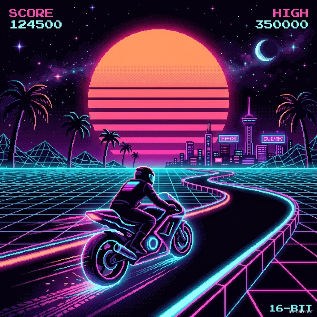
| Color Palette | Dark background (black/deep purple) + neon pink, cyan, light purple, orange-yellow accents | Extreme contrast between background and foreground |
| Grid Floor / Horizon | Perspective grid running toward the horizon — most iconic image of the style | Suggests digital space, cyberspace |
| Retrowave Sun | Circular or semicircular sun with parallel horizontal stripes | Originating from 1980s Synthwave album covers |
| Glow & Bloom | Light fringe (glow) around all lines — no sharp edges, everything radiates light | Lens bloom effect |
| Silhouette | Characters and objects are often black shadows placed against neon backgrounds | Increases drama and mystery |
| Scanlines / CRT | Old TV scan lines lightly overlaid on screen — suggests retro feel | Texture overlay, not geometry |
Operating Principles
Palette Built from Light, Not Color
The core distinction: rather than choosing colors for objects then adding light, Neon/Synthwave builds the entire image from light sources [S1]. Everything is dark — only edges and outlines glow. The result is the sensation of a world existing in darkness, defined only by neon light.
Simple Visual Hierarchy
This style works with 3 minimalist layers [S2]:
- Background: Nearly entirely black, only with faint grid and purple-blue gradient
- Midground: Solid silhouettes or dark geometry with neon outlines
- Foreground/Accent: Vivid neon light sources, text, UI elements
Application in Game UI
Neon Style is particularly strong in game interface design: dark menus with neon text, glowing health bars, neon particle effects in combat. This effect instantly creates a “hacking,” cyberpunk, future-tech sensation.
Game Examples
- Hotline Miami (Dennaton Games, 2012) — Uses vivid neon palette on dark background alongside extreme violence — creating a characteristic visual contradiction: world is brilliantly beautiful yet extremely brutal. Most credited single game for popularizing this aesthetic in gaming.
- Neon Abyss (Veewo Games, 2020) — Roguelite taking the full Neon/Synthwave aesthetic: dark dungeons with neon accents, neon particle effects on every hit.
- SUPERHOT (SUPERHOT Team, 2016) — Interesting polar opposite: chose minimalist white/red palette instead of multi-colored neon, but with the same principle of “light emanating from important objects, background completely dark.”
Trade-offs
| Aspect | Content |
|---|---|
| ✅ Advantages | Instantly creates a “cool” and sci-fi feeling. Low production cost — no complex textures needed, just colors and glow shaders. Extremely easily recognizable brand identity. |
| ❌ Disadvantages | Has become oversaturated in the indie market — risk of being considered a cliché if nothing else differentiates it. Hard to read in bright room conditions (neon on dark background). |
| ⚠️ Common Pitfall | ”Neon Chaos” — using too many neon colors simultaneously without a system. True Synthwave only uses 2-3 neon colors on a dark background — not a rainbow. |